Table of contents
Background Properties
CSS provides various properties to style the background of elements. Here are some commonly used ones:
1 . background-color: Sets the background color of an element.
- This property sets the background color of an element. You can use color names, hexadecimal, RGB, RGBA, HSL, HSLA values, etc.
.element {
    background-color: #ff0000; /* red */
}
2 . background-image: Sets an image as the background of an element.
This property sets an image as the background of an element.
You specify the path to the image using the
url()function.
.element {
    background-image: url('image.jpg');
}
3 . background-repeat: Specifies how a background image should be repeated.
This property specifies how a background image should be repeated.
Values include
repeat,repeat-x,repeat-y, andno-repeat.
.element {
    background-repeat: repeat-x; /* repeat horizontally */
}
4 . background-position: Sets the initial position of a background image.
This property sets the initial position of a background image.
You can use keywords like
center,top,bottom,left,right, or specify distances.
.element {
    background-repeat: repeat-x; /* repeat horizontally */
}
5 . background-size: Sets the size of the background image.
This property sets the size of the background image.
Values include
auto,cover,contain, or you can specify dimensions.
.element {
    background-size: cover; /* cover the entire element */
}
6 . background-attachment: Sets whether the background image scrolls with the content or remains fixed.
his property sets whether the background image scrolls with the content or remains fixed.
Values are
scroll,fixed, orlocal.
.element {
    background-attachment: fixed; /* background image doesn't scroll */
}
7 . background: Shorthand property to set all background properties in one declaration.
This property is a shorthand for setting all background properties in one declaration.
The order is
color,image,repeat,attachment,position,size.
.element {
    background: #ff0000 url('image.jpg') center/cover no-repeat fixed;
}
Some Basic examples
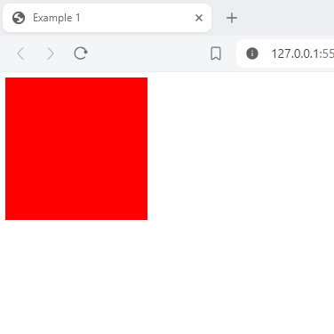
Example 1: Background Color:
<!DOCTYPE html>
<html lang="en">
<head>
    <meta charset="UTF-8">
    <meta name="viewport" content="width=device-width, initial-scale=1.0">
    <title>Example 1</title>
    <Style>
        .element {
            background-color: #ff0000; /* Red background color */
            height: 200px;
            width: 200px;
        }
    </Style>
</head>
<body>
    <div class="element"></div>
</body>
</html>
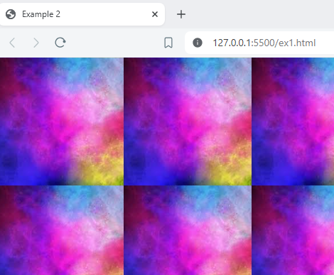
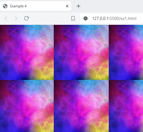
Example 2: Background Image:
<!DOCTYPE html>
<html lang="en">
<head>
    <meta charset="UTF-8">
    <meta name="viewport" content="width=device-width, initial-scale=1.0">
    <title>Example 2</title>
    <Style>
        body {
            background-image: url('image.jpg');
        }
    </Style>
</head>
<body>
</body>
</html>
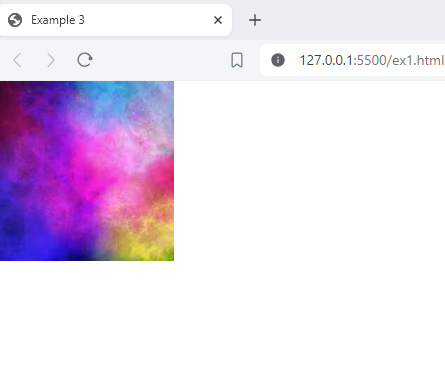
Example 3: Background Image with No Repeat:
<!DOCTYPE html>
<html lang="en">
<head>
    <meta charset="UTF-8">
    <meta name="viewport" content="width=device-width, initial-scale=1.0">
    <title>Example 3</title>
    <Style>
        body {
            background-image: url('image.jpg');
            background-repeat: no-repeat;
        }
    </Style>
</head>
<body>
</body>
</html>
Example 4: Background Image with Fixed Attachment
<!DOCTYPE html>
<html lang="en">
<head>
    <meta charset="UTF-8">
    <meta name="viewport" content="width=device-width, initial-scale=1.0">
    <title>Example 4</title>
    <Style>
        body {
            background-image: url('image.jpg');
            background-attachment: fixed;
        }
    </Style>
</head>
<body>
</body>
</html>
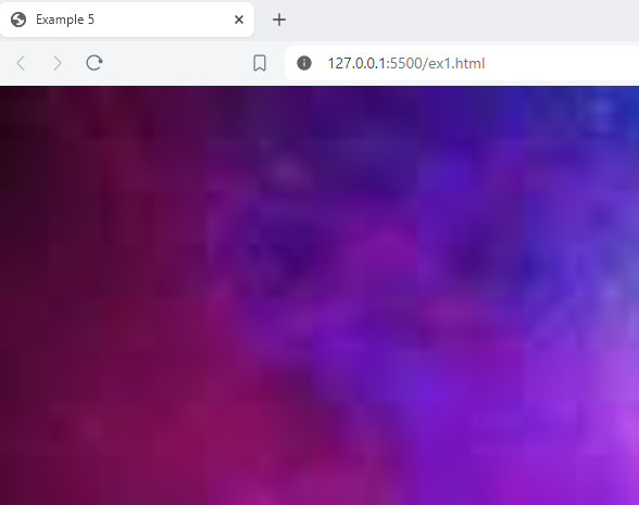
Example 5 : Background Image with Cover Size
<!DOCTYPE html>
<html lang="en">
<head>
    <meta charset="UTF-8">
    <meta name="viewport" content="width=device-width, initial-scale=1.0">
    <title>Example 5</title>
    <Style>
        body {
            background-image: url('image.jpg');
            background-size: cover;
        }
    </Style>
</head>
<body>
</body>
</html>
Example 6: Combining Multiple Background Properties:
<!DOCTYPE html>
<html lang="en">
<head>
    <meta charset="UTF-8">
    <meta name="viewport" content="width=device-width, initial-scale=1.0">
    <title>Example 6</title>
    <Style>
        body {
            background: #f0f0f0 url('image.jpg') center/cover no-repeat fixed;
        }
    </Style>
</head>
<body>
</body>
</html>
CSS Background Patterns
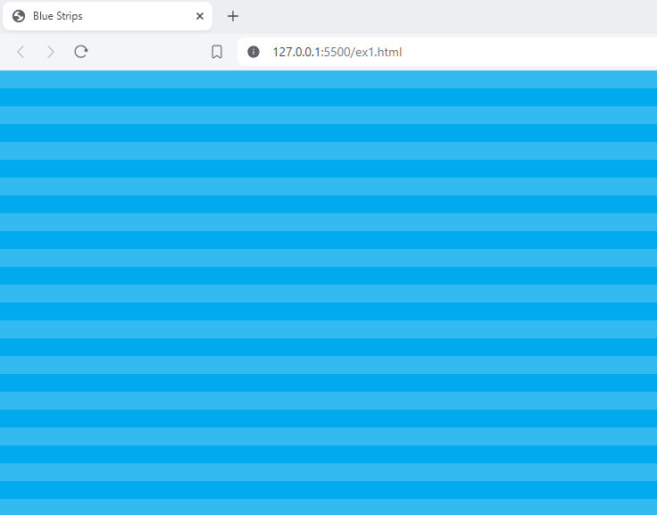
1 . Blue Strips
<!DOCTYPE html>
<html lang="en">
<head>
    <meta charset="UTF-8">
    <meta name="viewport" content="width=device-width, initial-scale=1.0">
    <title>Blue Strips</title>
    <style>
        body {
            background-size: 50px 50px;
            background-color: #0ae;
            background-image: linear-gradient(rgba(255, 255, 255, .2) 50%, transparent 50%, transparent);
        }
    </style>
</head>
<body>
</body>
</html>
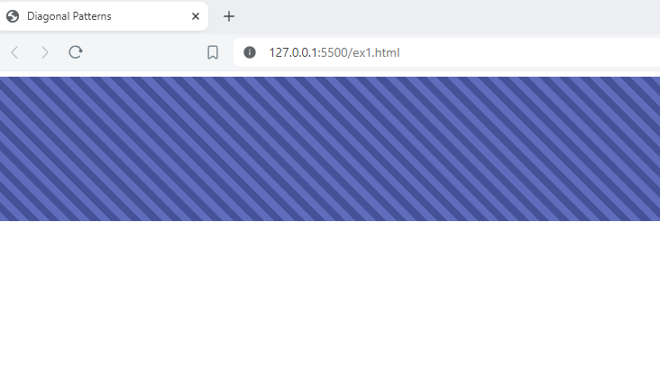
2 . Diagonal Striped Pattern:
<!DOCTYPE html>
<html lang="en">
<head>
    <meta charset="UTF-8">
    <meta name="viewport" content="width=device-width, initial-scale=1.0">
    <title>Diagonal Patterns</title>
    <style>
        .element{
            min-height:200px;
            background-image: repeating-linear-gradient(45deg,
            #606dbc,
            #606dbc 10px,
            #465298 10px,
            #465298 20px
            );
        }

    </style>
</head>
<body>
    <div class="element"></div>
</body>
</html>
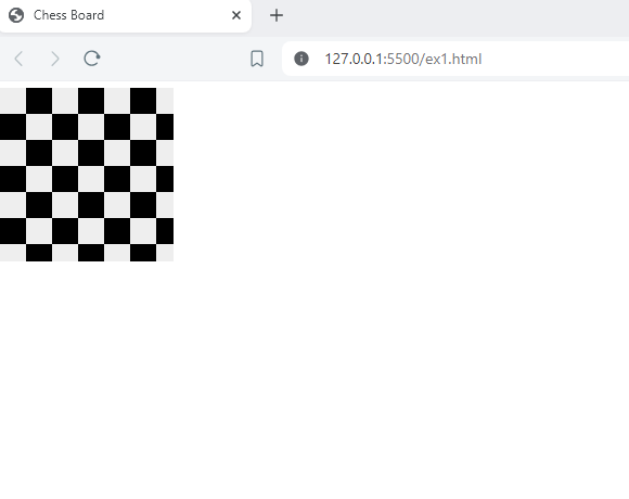
3 . Chess Board:
<!DOCTYPE html>
<html lang="en">
<head>
    <meta charset="UTF-8">
    <meta name="viewport" content="width=device-width, initial-scale=1.0">
    <title>Chess Board</title>
    <style>
        .element{
            background-color: #eee;
            background-size: 60px 60px;
            background-position: 0 0, 30px 30px;
            background-image: linear-gradient(45deg, black 25%, transparent 25%, transparent 75%, black 75%, black), linear-gradient(45deg, black 25%, transparent 25%, transparent 75%, black 75%, black);
            height: 200px;
            width: 200px;
        }

    </style>
</head>
<body>
    <div class="element"></div>
</body>
</html>
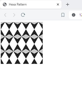
4. Hexagonal Pattern:
<!DOCTYPE html>
<html lang="en">
<head>
    <meta charset="UTF-8">
    <meta name="viewport" content="width=device-width, initial-scale=1.0">
    <title>Hexa Pattern </title>
    <style>
        .element{
            background-image:
        linear-gradient(30deg, #ccc 12%, transparent 12.5%, transparent 87%, #ccc 87.5%, #ccc),
        linear-gradient(150deg, #ccc 12%, transparent 12.5%, transparent 87%, #ccc 87.5%, #ccc),
        linear-gradient(30deg, #ccc 12%, transparent 12.5%, transparent 87%, #ccc 87.5%, #ccc),
        linear-gradient(150deg, #ccc 12%, transparent 12.5%, transparent 87%, #ccc 87.5%, #ccc),
        linear-gradient(60deg, #222 25%, transparent 25.5%, transparent 75%, #222 75%, #222),
        linear-gradient(-60deg, #222 25%, transparent 25.5%, transparent 75%, #222 75%, #222);
    background-size: 40px 70px;
               height: 200px;
            width: 200px;
        }

    </style>
</head>
<body>
    <div class="element"></div>
</body>
</html>
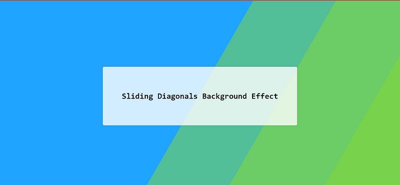
5 . Sliding Diagonal Effect
<!DOCTYPE html>
<html lang="en">
<head>
    <meta charset="UTF-8">
    <meta name="viewport" content="width=device-width, initial-scale=1.0">
    <title>Sliding Pattern </title>
    <style>
        html {
            height:100%;
        }

        body {
            margin:0;
        }

        .bg {
            animation:slide 3s ease-in-out infinite alternate;
            background-image: linear-gradient(-60deg, #6c3 50%, #09f 50%);
            bottom:0;
            left:-50%;
            opacity:.5;
            position:fixed;
            right:-50%;
            top:0;
            z-index:-1;
        }

        .bg2 {
            animation-direction:alternate-reverse;
            animation-duration:4s;
        }

        .bg3 {
            animation-duration:5s;
        }

        .content {
            background-color:rgba(255,255,255,.8);
            border-radius:.25em;
            box-shadow:0 0 .25em rgba(0,0,0,.25);
            box-sizing:border-box;
            left:50%;
            padding:10vmin;
            position:fixed;
            text-align:center;
            top:50%;
            transform:translate(-50%, -50%);
        }

        h1 {
            font-family:monospace;
        }

        @keyframes slide {
            0% {
                transform:translateX(-25%);
            }

            100% {
                transform:translateX(25%);
            }
        }
    </style>
</head>
<body>
    <div class="bg"></div>
    <div class="bg bg2"></div>
    <div class="bg bg3"></div>
    <div class="content">
    <h1>Sliding Diagonals Background Effect</h1>
</div>
</body>
</html>
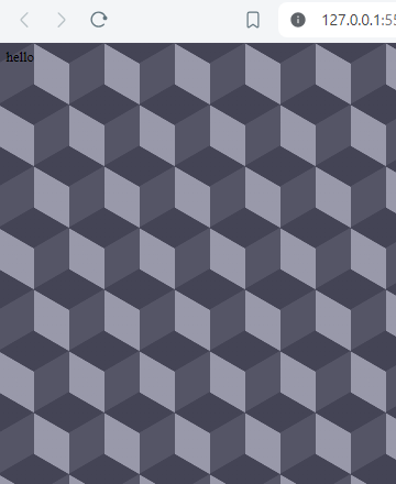
6. Cube Pattern
<!DOCTYPE html>
<html lang="en">
<head>
    <meta charset="UTF-8">
    <meta name="viewport" content="width=device-width, initial-scale=1.0">
    <title>Wave Pattern </title>
    <style>
        body {
            background-color:#556;
            background-image: linear-gradient(30deg, #445 12%, transparent 12.5%, transparent 87%, #445 87.5%, #445),
            linear-gradient(150deg, #445 12%, transparent 12.5%, transparent 87%, #445 87.5%, #445),
            linear-gradient(30deg, #445 12%, transparent 12.5%, transparent 87%, #445 87.5%, #445),
            linear-gradient(150deg, #445 12%, transparent 12.5%, transparent 87%, #445 87.5%, #445),
            linear-gradient(60deg, #99a 25%, transparent 25.5%, transparent 75%, #99a 75%, #99a),
            linear-gradient(60deg, #99a 25%, transparent 25.5%, transparent 75%, #99a 75%, #99a);
            background-size:80px 140px;
            background-position: 0 0, 0 0, 40px 70px, 40px 70px, 0 0, 40px 70px;
            }

    </style>
</head>
<body>
</body>
</html>